
Thursday, July 31, 2014
Wednesday, July 30, 2014

Tuesday, July 29, 2014
Vivi and I Go to Mass Moca
Our friend Vivian has been visiting from NYC and she and I went to Mass Moca yesterday.
I really loved the exhibit on the first floor. They were made of graphite and gold chrome. Beautiful. Here's Vivi with the brochure.

Sunday, July 27, 2014

Friday, July 25, 2014
What's this?
Part of my clean and tidy work space! It was such a mess! Thanks Deb for being an example!

Thursday, July 24, 2014

Painting for transformation
 I found this technique online and have found it to be very effective. It uses a single sheet of watercolor paper, but I took photos of the three stages to show the process.
1. Wet the paper. Drop colors that express your negativity onto the page. I also scratched the paint with the brush handle.
2. Then drop your idea of healing colors, letting them surround the negativity.
3. Paint the colors into a flower, to change the energy.

Wednesday, July 23, 2014

Tuesday, July 22, 2014

Monday, July 21, 2014

Sunday, July 20, 2014

Saturday, July 19, 2014

Friday, July 18, 2014

Thursday, July 17, 2014

Wednesday, July 16, 2014
The paper made me do it
Started to doodle on this paper called Shizen. Very rough and thick. It feels like fabric. Wanted to try it out. Fun!


Tuesday, July 15, 2014
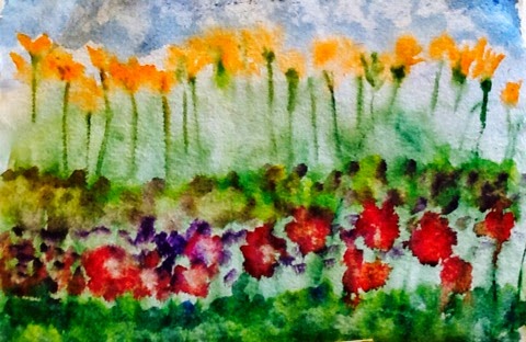
Still at it
Still stuck in cone flower hell. Not at all happy with this picture. I'll give it one more try after this.
Maybe there will be a. Shift in the planets.
PS OK I get it
I'm focused on the painting, but I see now that I need to fix the drawing!

Monday, July 14, 2014
Georgia O'Keefe I'm Not
 |
| oil pastel 6"x9" |
Back and forth we went. She sent me photos of her bed spread--not the colors of my pic. She sent me a photo of her walls. I saw coffee and cream, she saw white. She found a photo in her phone of an old painting of a flower of mine with the colors she liked. The colors were not that of the original! I found the original photo of the pic in an album on Photobucket. The colors were different! Tech-NO! Corruption and miscalibration!
This is what designers face every day. So, OK. I offered to do a painting, of cone flowers in autumnal colors, big-18x24.
Now comes the fun. I have been doing very small watercolors for the blog and for our Saturday class. Fast, impulse, gesture-type pictures. 4"x6" approx.
How to enlarge this little pic to 18"x24" and keep the integrity of the original?
I already agreed to change the colors as well as the size; and what about the background? There's sooo much more of it to fill in.
 |
| soft pastel 18"x24" |
I decided to use soft pastel. I feel comfortable using them and have gotten good results, especially with flowers. There was so much background to fill in, and they're so messy.
I tried again with watercolor, but expanding the flowers to giant size felt unsettling. They lost their delicacy and they came out looking very heavy handed and like spiders. Yuk.
Seeing this latest version at night, I also realized that this picture is going in a bedroom and will probably be viewed mostly in low light. That's an important consideration for the choices I make.
 |
| watercolor 18"x24" |
Hmmm. Since the request is for autumnal colors, I'm thinking now of changing the type of flower, or maybe doing something completely different, like leaves. I'll have to talk to my sister and see what she thinks. So it's back to the drawing board for me.
Saturday, July 12, 2014

Friday, July 11, 2014

Thursday, July 10, 2014

Wednesday, July 9, 2014

Monday, July 7, 2014
Shirley, you jest?
Feeling like the punchline of a joke today...got good news and bad. Good cause the medical tests were negative; bad 'cause they don't know what I've got. Oh well. I'll just sweat it out.

Sunday, July 6, 2014
Materials, girl
I had drawn some cone flowers the other day, using watercolor paints and oil pastels. My sister loved it and asked me to do another, for her, much larger. This one is only 6" x9".
Well, I've been out of watercolor paper for a few weeks, using multimedia instead. It worked well enough for sketchy stuff and quick washes. For the blog and class I cut it into small pieces. The piece my sister asked for is 18"x24". I had some that size but it's made for acrylic. I figured I'd try it. Maybe I could get something interesting out of it. Ouch. It buckled, dripped, stained. You name it. It made the brush drag and gave me a neck ache. So I grabbed some oil pastel to see what I could do. Blech. Better look for the Michael's coupon. I hope paper is on sale.


Well, I've been out of watercolor paper for a few weeks, using multimedia instead. It worked well enough for sketchy stuff and quick washes. For the blog and class I cut it into small pieces. The piece my sister asked for is 18"x24". I had some that size but it's made for acrylic. I figured I'd try it. Maybe I could get something interesting out of it. Ouch. It buckled, dripped, stained. You name it. It made the brush drag and gave me a neck ache. So I grabbed some oil pastel to see what I could do. Blech. Better look for the Michael's coupon. I hope paper is on sale.
Friday, July 4, 2014
Thursday, July 3, 2014


Wednesday, July 2, 2014

Tuesday, July 1, 2014
Forest Stumped
OK Here's my challenge:
I lOVE trees, forest, ferns, etc. I love the darkness, dampness?, tangle of forest litter, branches, shrubs and wildflowers. I love the complexity and the details, the quiet and the mystery.
 OK so how do I paint all that, with watercolor...? Watercolor is best with light and white space. With a definite stoke, but a light touch. It's not forgiving and cannot be worked without turning muddy.
I'm asking myself how to capture the scene so it 'reads' well, how to paint a more complex picture, yet retain the beauty and lightness of the medium.
I've tried several approaches, a few which are shown here. I switched to ink in order to try to focus more on the forms.
I question my reference...not a lot of contrast. Perhaps it's not the best model. Thoughts are welcome.


I lOVE trees, forest, ferns, etc. I love the darkness, dampness?, tangle of forest litter, branches, shrubs and wildflowers. I love the complexity and the details, the quiet and the mystery.
OK so how do I paint all that, with watercolor...? Watercolor is best with light and white space. With a definite stoke, but a light touch. It's not forgiving and cannot be worked without turning muddy.I'm asking myself how to capture the scene so it 'reads' well, how to paint a more complex picture, yet retain the beauty and lightness of the medium.
I've tried several approaches, a few which are shown here. I switched to ink in order to try to focus more on the forms.
I question my reference...not a lot of contrast. Perhaps it's not the best model. Thoughts are welcome.
Subscribe to:
Posts (Atom)